Intentify
Tools
Figma, Adobe Illustrator, Photoshop
Role
UX strategist, user research, wireframing, prototyping, UI design, brand design
Approach
Agile methodology, Double Diamond, Human Centred Design, Design Thinking
8 weeks
Phase 1: Research
Defining the Problem
Impulse shopping is often characterised by the inability to resist the urge to purchase goods and services.
These impulsive purchases can often lead to problems like:
financial strain,
increased clutter,
feelings of guilt post-purchase, and
relationship issues due to irresponsible spending.
Research Objective
To understand the factors that contribute to impulsive online shopping, to gauge the impact it has on individuals and their social circles, and to explore the strategies that could be implemented to curb this behaviour.
Desk Research
78
.2
%
of British adults have succumbed to impulsive online shopping
67
%
survey respondents admit to making purchases when stressed
29
.3
%
of those guilty of an impulsive purchase admit to feeling regret after
Hypothesis
I collected a pool of interviewees based on the criteria of their ages between 20-35 years old and their self-identification as an impulse shopper. The goal was to understand their behaviour behind impulse shopping and what would cause them to do it.
N.E., 29 years old (Female)
She is a young professional who shop impulsively almost every day. She would shop when she feels upset or when she has an event to go to. She is addicted to shopping and she knows that it’s an issue.
C.R., 23 years old (Female)
She is in between jobs at the moment and shops mostly due to sales or when an upcoming event causes a need to arise. She would shop when she is happy and buys things when she likes the look of it.
A.M., 27 years old (Female)
She is a student just graduated from Masters and currently looking for work. She would shop to alleviate stress or when she’s had a bad day. She prefers quantity purchases over quality items, so she uses cheap websites often to acquire items.
S.S., 22 years old (Male)
He is a filmmaker who would impulsively do a big shop when there is a sale or when a need arises. He would only buy from quality retailers and post-rationalise about his quality buys to make himself feel better about spending the money.
S.M., 20 years old (Male)
A university student who impulsively shops for an aspirational view of self. He gets influenced by targeted ads and sponsorships, to the point of getting scammed by social media advertising.
N.D., 23 years old (Female)
She is a young professional who shops once to twice a month on clothes mostly through offline retail shops or online shopping platforms. She shops when she is feeling good about herself or when there is an occasion that causes a need to arise.
M.D., 23 years old (Female)
A student who is an emotional shopper, she buys food when she is feeling down or upset to make herself feel better. She goes online everyday to see what is out there and would leave things in the cart to buy later.
Key Insights
To synthesise the qualitative data collected through interviews, I organised them into an Affinity Map according to statements which are behaviours, motivations, and pain points.
6 of 7
interviewees shop with no plan and end up spending more than they initially thought they would.
5 of 7
mentioned that they would post-rationalise a purchase and self-justify to make themselves feel better after a purchase.
5 of 7
feel guilty after the purchase so they try to alleviate their feelings of regret through returning items and hiding items out of sight.
5 of 7
would most likely shop when they are aware of a discount sale happening.
But this insight below surprised me the most as this negated my initial hypothesis.
3 of 7
shop when they are feeling down as a form of self-relief.
Phase 2: Define
Themes and Direction
I pulled 7 themes from the interview synthesis ranging from ‘Unawareness of Marketing Tactics’ to ‘Buying an Aspiration’. Depending on which theme I moved forward with, I could tackle different parts of the issue.
This was the most challenging part as the problem is quite huge, and there hasn’t been a lot of solutions created to tackle this. Struggling to pick which theme to move forward with, I ended up doing task flows for 3 themes before settling on one.
Dealing with clutter:
Peer-to-peer clothes renting platform
Dealing with financial visibility:
Personal finance budgeting platform
Dealing with lack of planning:
Shopping prioritisation platform
I decided to focus on the theme of ‘Lack of Prioritisation and Planning’. Not only does this theme have the most key data points, I will be able to help the most people as this is a shared issue among interview participants.
Effective planning and prioritising their wants could potentially reduce their tendency to resort to spending impulsively.
Theme
Insight Statement
Fuelled by a lack of prioritisation and planning, consumers often succumb to impulse shopping which gradually eats into their savings, leading to financial strain and regret.
How Might We
With the chosen theme in mind, I formulated a focused problem statement that will serve as a guide to design a targeted solution.
Key Opportunities
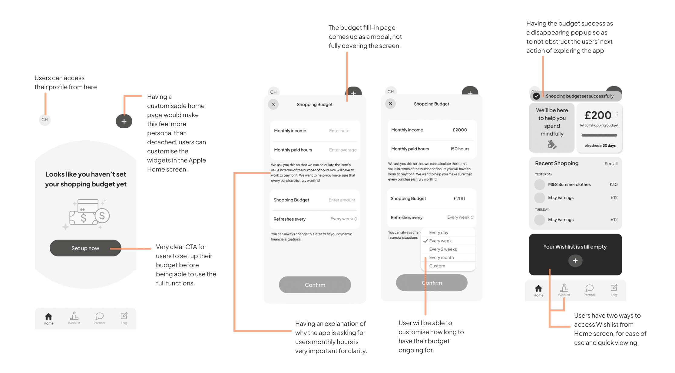
Creating a Shopping Budget
One of the interviewees mentioned that how they deal with their ‘bad habit’ is through having an allocated space within their budget for their shopping. This gives them flexibility while preventing financial strain.
Creating an Items Wishlist
Creating a universal wishlist helps the users stop to think and see everything they want to buy, so this helps them reconsider whether one purchase is more worth it than the other. This prevents feelings of regret post-purchase.
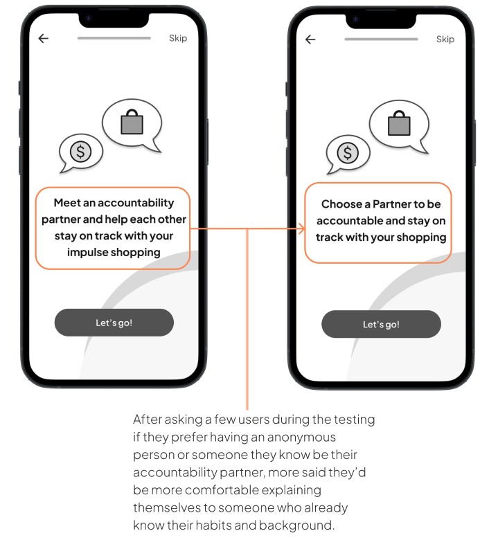
Having an Accountability Partner
Finding support and accountability can go a long way in preventing impulsive spending. The transparency and having to explain themselves pushes users to stick to their budget.
Task Flow
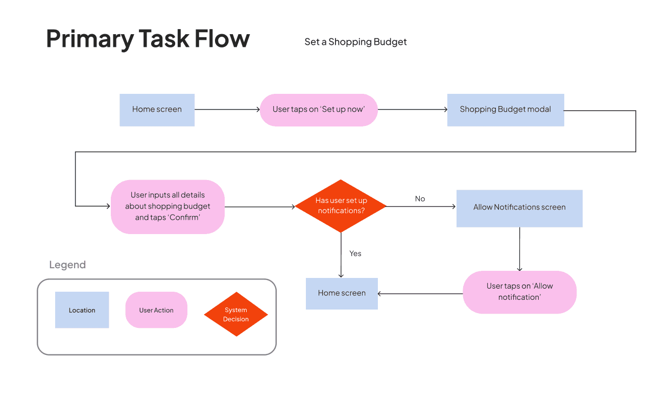
I created a primary and secondary task flow to help Emma create a shopping budget to help with financial visibility and create a purchase wishlist so that she can prioritise which she actually finds worth it - to give her a time to cool down and prevent any regrets.
Information Architecture
Phase 3: Develop
Sketches
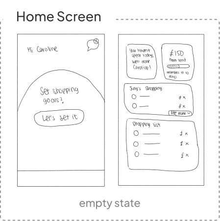
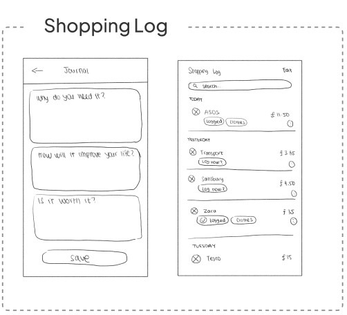
For each screen, I drew 2-3 exploratory sketches for how the layout could look and got feedback from my colleagues. The sketches below are the chosen solution sketches that I wanted to take my screens in the direction of.
Wireframing
Through digital wire-framing and the creation of a mid-fidelity prototype, I was starting to develop a more concrete visual representation of the user experience.
User Testing 1
To assess a design's interface, I formulated a user test plan consisting of tasks for users to complete and facilitated a usability testing with a clickable prototype. Then, I proceeded to plot the changes in a prioritisation matrix from high to low value and high to low effort.
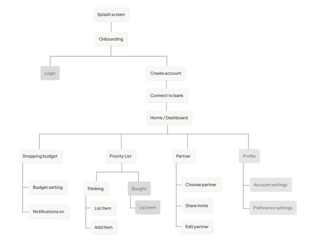
Added a Preliminary flow for account creation and to onboard users to their banks
This completes the logic of the flow from the start and shows how the user would connect to their bank.
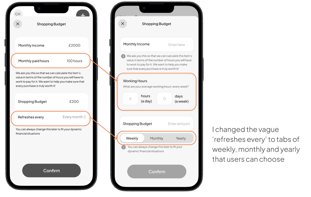
Changed the monthly hours input within ‘Set a Shopping Budget’ screen into something that requires less effort for users
This simplifies the effort exerted for users to set up their account, therefore prevents the rate of drop off.
Omitted the Shopping Log feature as this is too much work for the users, not going to be effective in deterring them. It will just be ignored
This is too much work for the users every time they would want to purchase something, they will be annoyed by the app and it’s not going to be effective in deterring them. Hence, it will just be ignored.
User Testing 2
Having addressed issues from the initial user testing, I proceeded to collect feedback in a second round. I engaged five individuals using the same script and scenario, but with adjusted tasks for further evaluation.
Brand Development
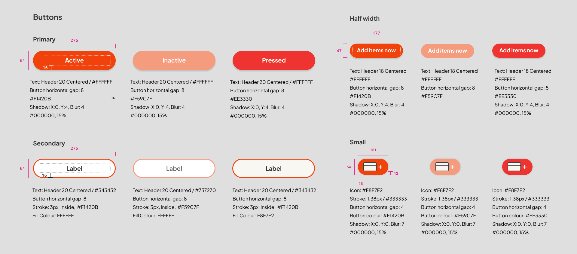
UI Library
Below is a snippet of the library to showcase the icons, components and layout design with measurements in pixels
Phase 4: Deliver
Marketing Website
Key Takeaways
Define it. Design it. Deliver it.
carolineghelenu@gmail.com


